
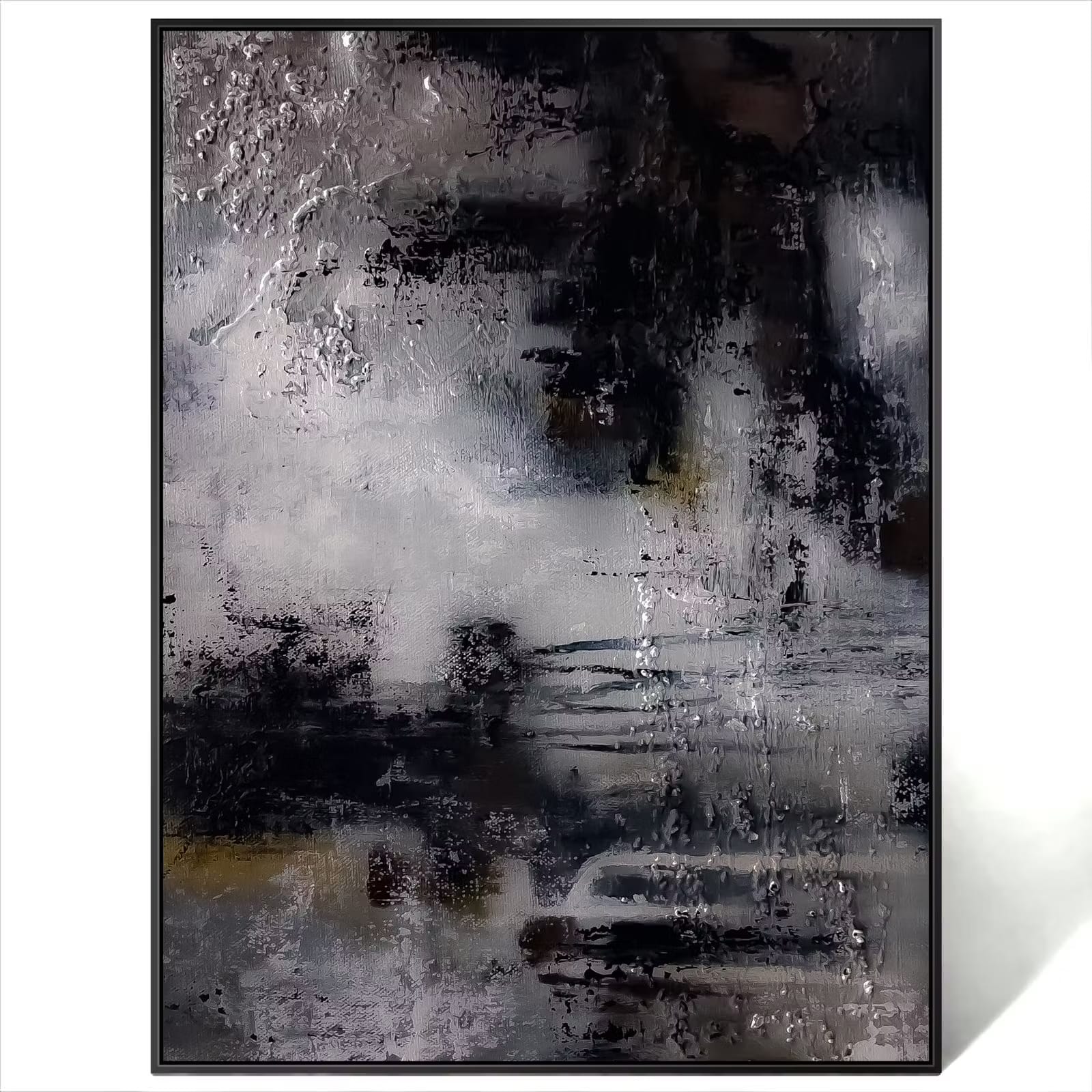
Modern interiors often rely on clean lines, uncluttered surfaces, and carefully chosen materials. Artwork adds character to these spaces, but the size, colour, and composition need to work with the architecture rather than compete with it. Minimalist abstract paintings offer a way to introduce visual interest through simple shapes, restrained colours, and deliberate use of empty space. They can complement furniture, soften plain walls, and create a focal point without filling the room with unnecessary detail. Choosing Minimalist Abstract Wall Art starts with understanding how the artwork relates to the room’s layout, natural light, and existing finishes.
Why Minimalist Abstract Art Suits Modern Interiors
Minimalist artwork focuses on a limited number of visual elements. A painting may use broad colour fields, geometric shapes, subtle lines, or textured surfaces to create interest without a complicated composition. This restraint works well with modern interiors, where furniture and architectural details often have strong, simple forms. The artwork can introduce contrast while allowing the room’s proportions and materials to remain visible. Its effect depends on choosing a piece that feels connected to the space rather than treating the wall as an isolated area.
Minimalism does not require every surface to be white or every accessory to be removed. A room can include warm wood, stone, linen, metal, and textured fabrics while maintaining a simple visual structure. Abstract paintings help connect these materials by repeating a colour, introducing a contrasting tone, or adding a different surface quality. The result can feel calm without appearing plain. Consider the complete room before selecting artwork, including the furniture silhouettes, floor finish, window treatments, and decorative objects.
When comparing minimalist paintings, look at these characteristics:
- Simple composition: Shapes and lines remain easy to distinguish from a distance.
- Restrained colour palette: A few coordinated colours help the painting relate to the surrounding decor.
- Intentional empty space: Open areas within the composition give the eye room to rest.
- Texture and depth: Raised paint or layered surfaces add detail without requiring many colours.
- Suitable proportions: The canvas dimensions complement the wall and nearby furniture.
These qualities can appear in both small paintings and oversized canvases. A simple composition may still have a strong visual presence when its scale is appropriate for the room. Conversely, a small painting with many intricate details may feel less suitable for a large, uncluttered wall. Judge the artwork by its overall shape and visual weight, not just by how many elements it contains. The right balance allows the painting to contribute character without disrupting the room’s visual order.
Use Negative Space to Give Artwork Room
Negative space refers to the empty areas surrounding objects or shapes within a composition. In interior design, it also describes the open areas around furniture, decorations, and artwork. Both forms of space matter because they affect how easily the eye can move around a room. A minimalist painting may depend on its empty areas as much as its visible shapes. Crowding it with shelves, small frames, or decorative accessories can weaken that effect.
Begin by identifying the wall’s main focal point. This might be the area above a sofa, the wall facing the entrance, or a section that is visible from the dining area. Avoid placing the painting too close to door frames, tall cabinets, or wall lights if these features make the arrangement feel cramped. Leave enough room around the canvas for its outline to remain clear. Open wall space is not wasted space when it helps the artwork stand out.
Furniture placement should support this sense of openness. A low sofa beneath a large painting can leave enough visible wall to create a balanced arrangement, while tall furniture may require a different canvas position. Keep nearby accessories limited when the painting already has a strong shape or textured surface. If the room contains several decorative elements, choose artwork with a simpler composition. This approach creates visual order without requiring every item to follow the same style.
Build a Neutral Palette with More Than One Texture
Neutral interiors can include ivory, beige, grey, taupe, brown, and muted earthy shades. These colours provide a flexible background for minimalist artwork because they allow differences in texture and shape to remain visible. However, using one colour across every surface can make a room feel flat. Varying the materials introduces depth while keeping the overall palette restrained. Consider how matte paint, natural wood, woven fabric, stone, and metal interact under the room’s lighting.
A painting does not need to match the wall exactly. A warm beige canvas can stand out against a cooler grey wall, while black lines or dark shapes can provide definition in a pale room. Subtle colour differences often create more interest than matching every element precisely. Choose a dominant tone and repeat it in a few places rather than spreading it across every accessory. This keeps the interior coordinated while allowing the artwork to retain its own identity.
Texture is particularly useful in minimalist rooms because it adds variation without introducing many competing colours. A smooth canvas, raised acrylic strokes, rough stone, woven cushions, and natural wood can create distinct surface qualities. The aim is to balance these differences rather than place every textured item together. If the painting has heavy raised details, keep some nearby surfaces relatively smooth. If the artwork is visually flat, textured furnishings can add dimension around it.
Choose Artwork That Relates to Architectural Lines
Modern interiors often contain strong horizontal and vertical lines from windows, doors, cabinets, ceiling details, and furniture. Artwork can reinforce these lines or provide contrast. A horizontal canvas may relate well to a long sofa, while a vertical composition can complement a narrow wall or tall architectural feature. Square artwork can provide balance where the surrounding forms have similar proportions. Select the shape according to the available wall space and the visual structure of the room.
Circular artwork creates a different effect because its curved outline contrasts with rectangular furniture and architectural features. Wood circle wall art can introduce a rounded shape into an interior dominated by straight lines. Before selecting a circular canvas, check its diameter and the amount of open wall around it. A circle may need more breathing room than a rectangular piece of the same width because its edges do not extend into the corners. Position it carefully so that the shape feels intentional rather than disconnected from the surrounding arrangement.
The artwork’s internal composition should also relate to the room. Broad horizontal shapes may complement a long wall, while vertical forms can draw attention upward. A painting with irregular shapes can soften a room filled with straight lines and smooth surfaces. Repeating every architectural line is not necessary, since contrast can make the arrangement more interesting. Focus on the overall relationship between the painting, furniture, and wall proportions.
Style a Gallery Wall Without Losing Simplicity
A gallery wall can work in a minimalist interior when the selection and spacing remain controlled. Rather than filling the entire wall with unrelated pieces, choose artwork that shares a colour family, compositional style, or consistent frame finish. Leave enough space between paintings to distinguish each piece while allowing the group to read as one arrangement. The overall outline of the gallery wall should suit the furniture and wall dimensions. Plan the arrangement before hanging anything permanently.
Paired artwork offers a more structured alternative to a larger gallery wall. A minimalist 3d wall art set of 2 can create a balanced display when the two paintings share related colours, shapes, or textures. They do not need to be identical, but their visual weight should feel compatible. Measure the total width of both canvases, including the gap between them, before deciding where to hang the set. Keep their alignment consistent with the furniture or architectural feature beneath them.
Use these guidelines to maintain a clean arrangement:
- Select paintings with a shared visual theme or a limited colour palette.
- Keep spacing consistent between pieces in a gallery wall.
- Align the outer edges or centres where this supports the overall layout.
- Avoid mixing too many frame colours, canvas shapes, and decorative styles.
- Check the complete arrangement from the main seating position before installing the artwork.
A simple arrangement often benefits from one clear focal point. If several paintings have equally strong colours or patterns, they may compete for attention. Use one dominant piece and let smaller works provide supporting detail. Alternatively, choose paintings with similar visual weight for a more uniform arrangement. The amount of wall space available should guide the final layout.
Add Colour Without Overcrowding the Room
Minimalist interiors can include colour without losing their sense of order. A painting with one or two saturated shades can provide contrast against neutral walls and furnishings. Repeat one of those shades in a cushion, vase, or small decorative item if you want to connect the artwork with the rest of the room. Avoid introducing too many unrelated colours around a painting that already has a strong palette. The goal is to give colour a clear purpose within the arrangement.
For interiors that need a stronger visual accent, Modern Colorful Wall Art can introduce brighter tones while preserving a contemporary look. Consider the size of the painting and the intensity of its colours before choosing its position. A vivid canvas may need more open wall space than a subdued composition. If the room already contains colourful rugs or patterned furniture, select artwork that relates to a few existing tones. This keeps the painting connected to the interior without making the space feel visually crowded.
Position and Light Your Artwork Carefully
The height and lighting of a painting affect how it appears in a room. A common starting point is to position the centre of the artwork around 57 to 60 inches above the floor, then adjust according to furniture height and viewing position. Above a sofa or console table, leave a suitable gap so the canvas feels connected to the furniture without appearing cramped. Measure the finished artwork, including its frame, before marking the wall. Paper templates can help you test the placement without making unnecessary holes.
Natural light reveals colour and surface detail, but strong direct sunlight may damage artwork over time. Observe the direction of sunlight before choosing a permanent position. For evening lighting, use suitable LED fixtures or picture lights that illuminate the canvas evenly without creating distracting glare. Textured paintings may cast shadows under directional light, so check the effect from the main seating area. Keep hot fixtures at a safe distance and follow the manufacturer’s installation guidance.
Conclusion
Minimalist abstract artwork works best when its proportions, colours, and textures relate to the room around it. Give the painting enough open space, use materials to create depth, and choose shapes that complement the architecture without copying every line. A carefully positioned canvas can provide character while keeping the interior calm and uncluttered. Start with the wall and furniture measurements, then select artwork that suits the space rather than forcing the room to accommodate it.
Frequently Asked Questions
1. What is minimalist abstract wall art?
Minimalist abstract wall art uses simplified shapes, lines, colours, and textures instead of detailed representations of people or objects. Its composition often relies on restraint and open space to create visual interest.
2. Which colours work well with minimalist abstract paintings?
Neutral shades such as white, beige, grey, taupe, and brown work well with minimalist artwork. Muted greens, blues, and occasional stronger accents can add contrast when they relate to the room’s existing palette.
3. How do I decorate a modern room with minimalist canvas art?
Choose a canvas that suits the wall and furniture proportions, then consider its colours, shapes, and texture. Leave sufficient open space around the painting and avoid surrounding it with too many competing decorations.
4. Can minimalist artwork include texture?
Yes. Raised acrylic paint, layered brush strokes, and varied surface finishes can add depth without requiring a complicated composition. Balance textured artwork with simpler furnishings and surfaces.
5. How should I hang minimalist abstract wall art above a sofa?
Measure the sofa and select artwork that relates to its width. Position the painting with a comfortable gap above the sofa, check its alignment from the main seating area, and use suitable wall fixings for its weight.